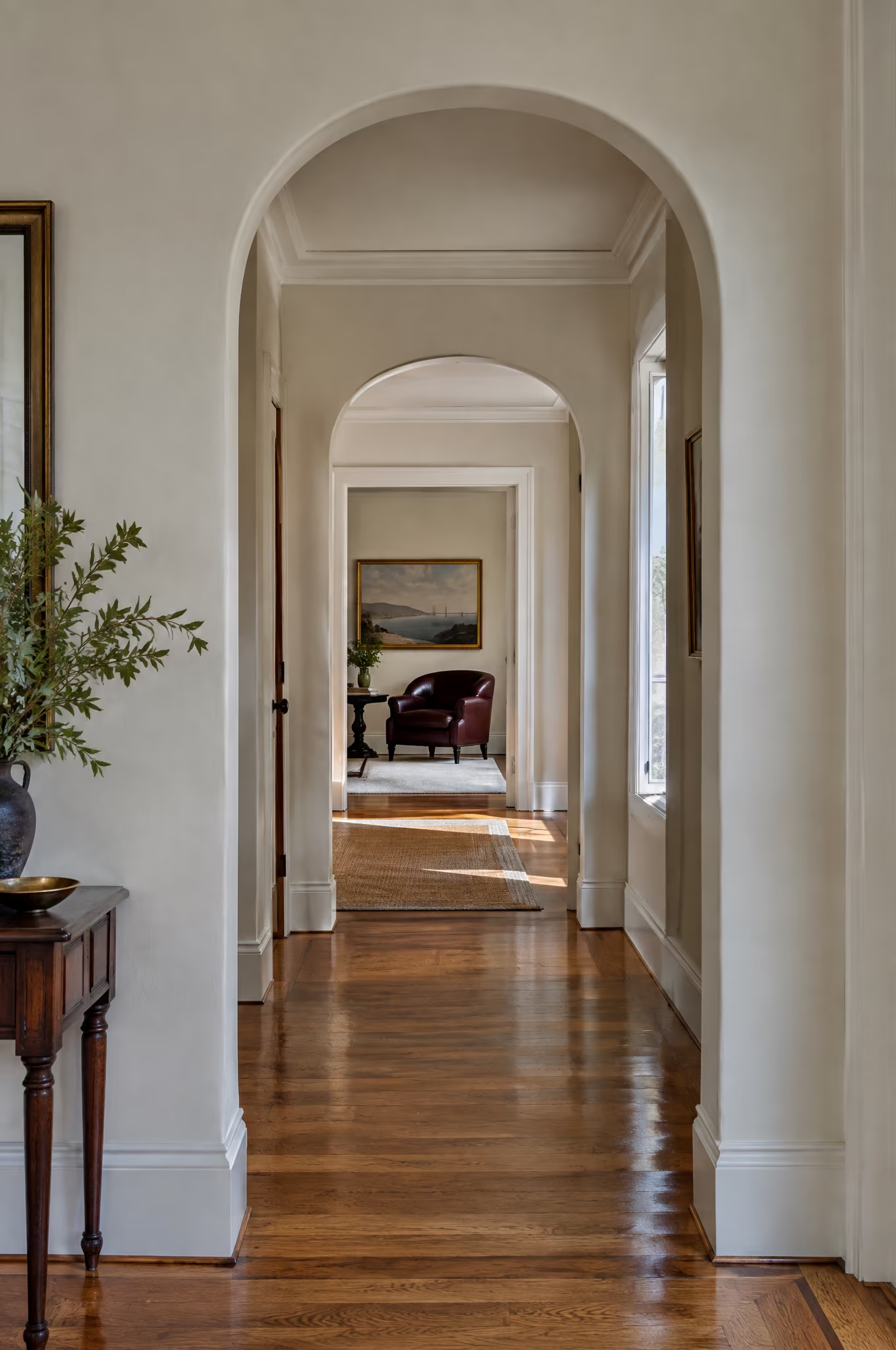
This document outlines our strategic approach for the visual identity and digital presence of Pastarello.
The objective is to create a distinctive, cultured and personal brand that reflects Pastarello’s position at the intersection of interior design, art, architecture and storytelling.
This document translates key insights from the discovery phase into a cohesive creative direction, establishing a foundation for a brand that feels collected, assured and made to last.
- 01Overview
- 02Creative Strategy
- 03Visual Direction
- 04Next Steps

Brand Overview
01
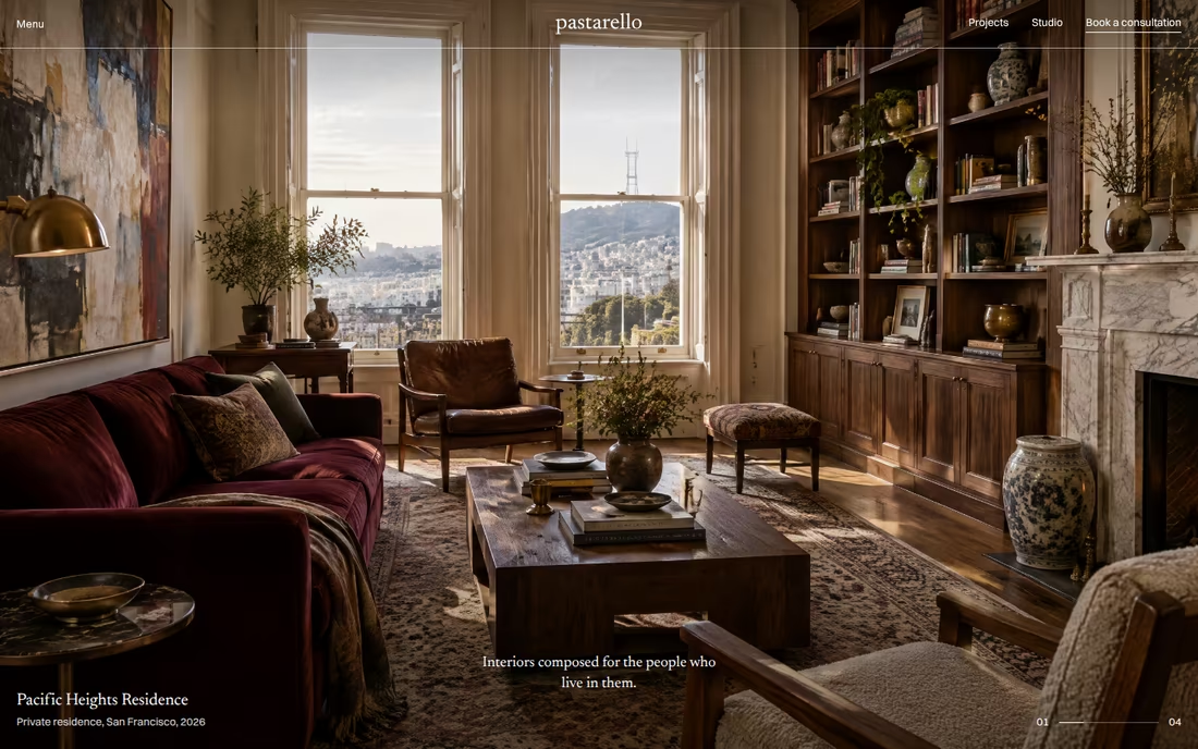
“Interiors composed for the people who live in them.”
Pastarello is an art-driven interior design studio in San Francisco, creating highly personal, collected interiors through contemporary design, historical references, colour, materiality and custom craftsmanship.
Rooted in a lifelong study of art, architecture and film, the studio approaches interiors as compositions, layering architecture, furniture, art, light and objects until a home feels collected, personal and alive.
Pastarello is not defined by a signature look but by a signature point of view. The designer is not the protagonist; the client is.
What You Told Us
Born from generations of creative practice and a background in fine art and film, where environment and character are inseparable.
To create homes that tell the story of the people who live in them, rather than rooms that demonstrate the designer’s taste.
Working at the highest level of design while staying warm, curious and unpretentious: confident, never a luxury brand trying to impress.
A nationally recognised, highly selective studio with a cultural point of view, invited to interesting places rather than everywhere.
Mission and Why Now
Why Pastarello Exists
A home should do more than look beautiful. It should tell the story of the people who live in it.
Too many high-end interiors are prescribed: a signature look applied from house to house, polished for the photograph and unchanged by the people who live there.
Pastarello exists to do the opposite: to listen, then edit, interpret and elevate a client’s own story, and to leave rooms that keep evolving long after the studio has gone.
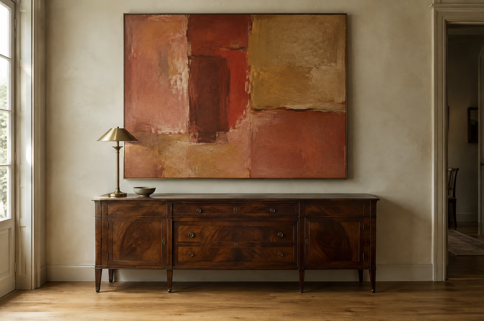
Make homes that could belong to no one else.
Create collected, personal interiors that give clients something they could not have imagined on their own, and that still feel completely like them.
Brand Foundations
Pastarello’s foundations define how the studio designs, collaborates and communicates. They guide every decision, from the first conversation to the last object placed in a room.
No two projects alike. The client’s story, collections and rituals lead every decision.
Every object earns its place. Rooms carry memory, history and intention.
A process of discovery, open to the idea that is not the obvious one.
Custom pieces made by artists and makers the studio knows by name.
Wit, colour and pleasure. Sophisticated without becoming solemn.
Architecture, art, furniture, material and light balanced as one picture.
Founder-led and studio-powered, built on trust with clients and makers.
Rooms that become richer through use, accumulation and time.
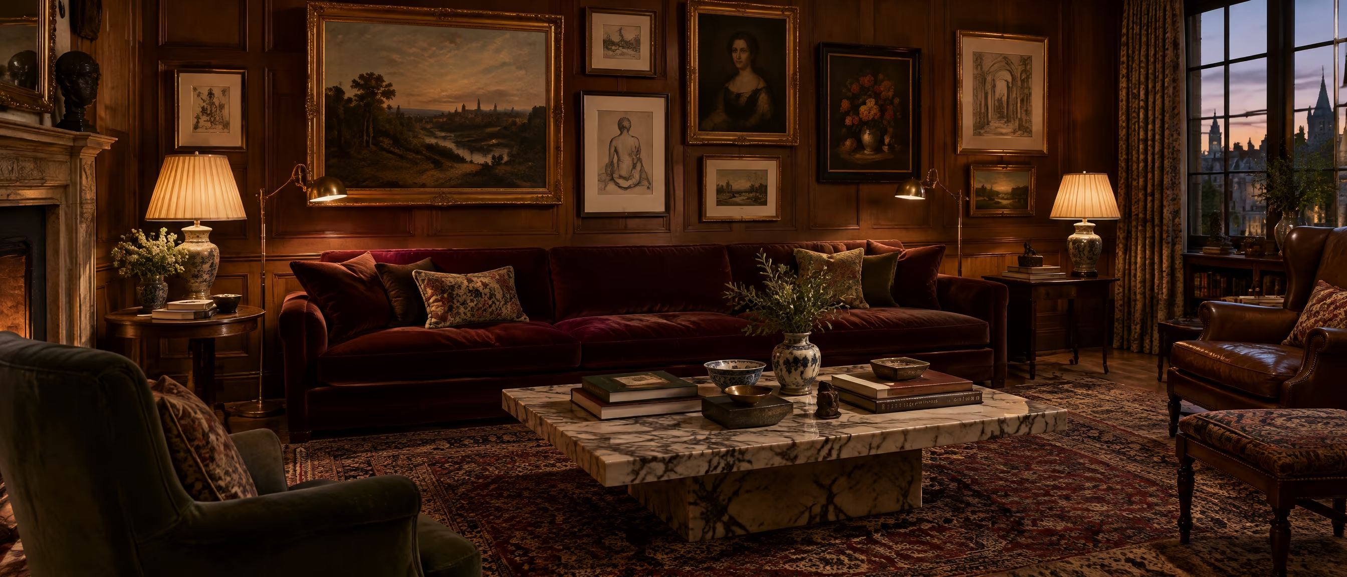
Brand Personality
and Voice
Pastarello should feel like an exceptionally interesting person you want to spend time with: curious, cultured and confident, but never self-important.
Brand Personality
- Curious and cultured
- Confident, never self-important
- Warm, witty and personal
- Seductive and unexpected
- Precise in every detail
Brand Tone
- Cultured, but easy to understand
- Warm and assured
- Witty, never clever for its own sake
- Precise and specific
- Serious about the work, not about itself
Audience &
Positioning
Audience
Private clients undertaking significant renovations and highly customised homes, in San Francisco and beyond. They value perspective over prescription, craftsmanship over status and character over trends, and they are willing to be challenged.
Positioning
Pastarello positions itself as a founder-led creative studio rather than a luxury design brand. Unlike studios selling a signature look, Pastarello brings a strong point of view to each client’s story and leaves homes that feel unmistakably theirs.
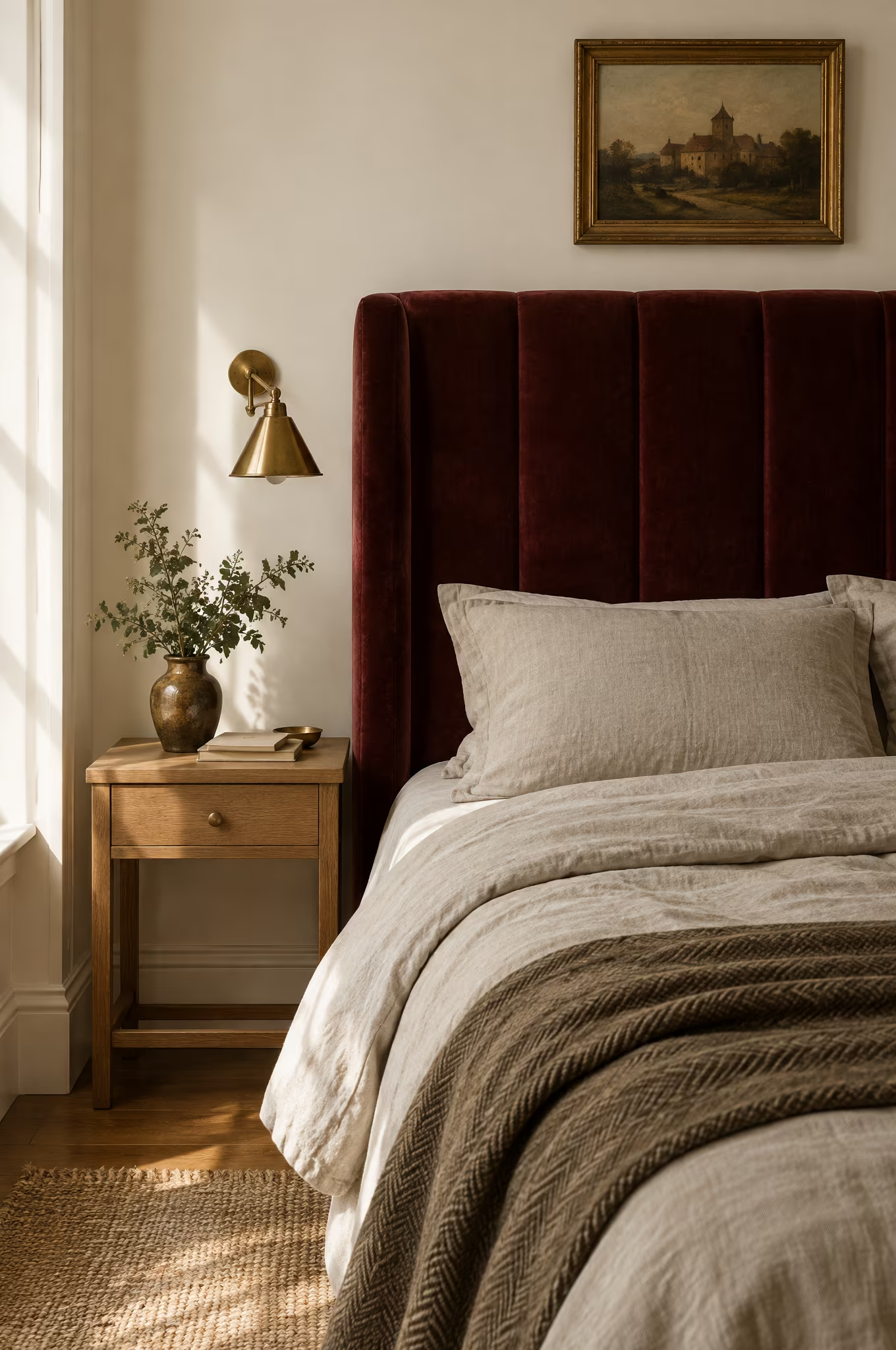
Creative Strategy
02
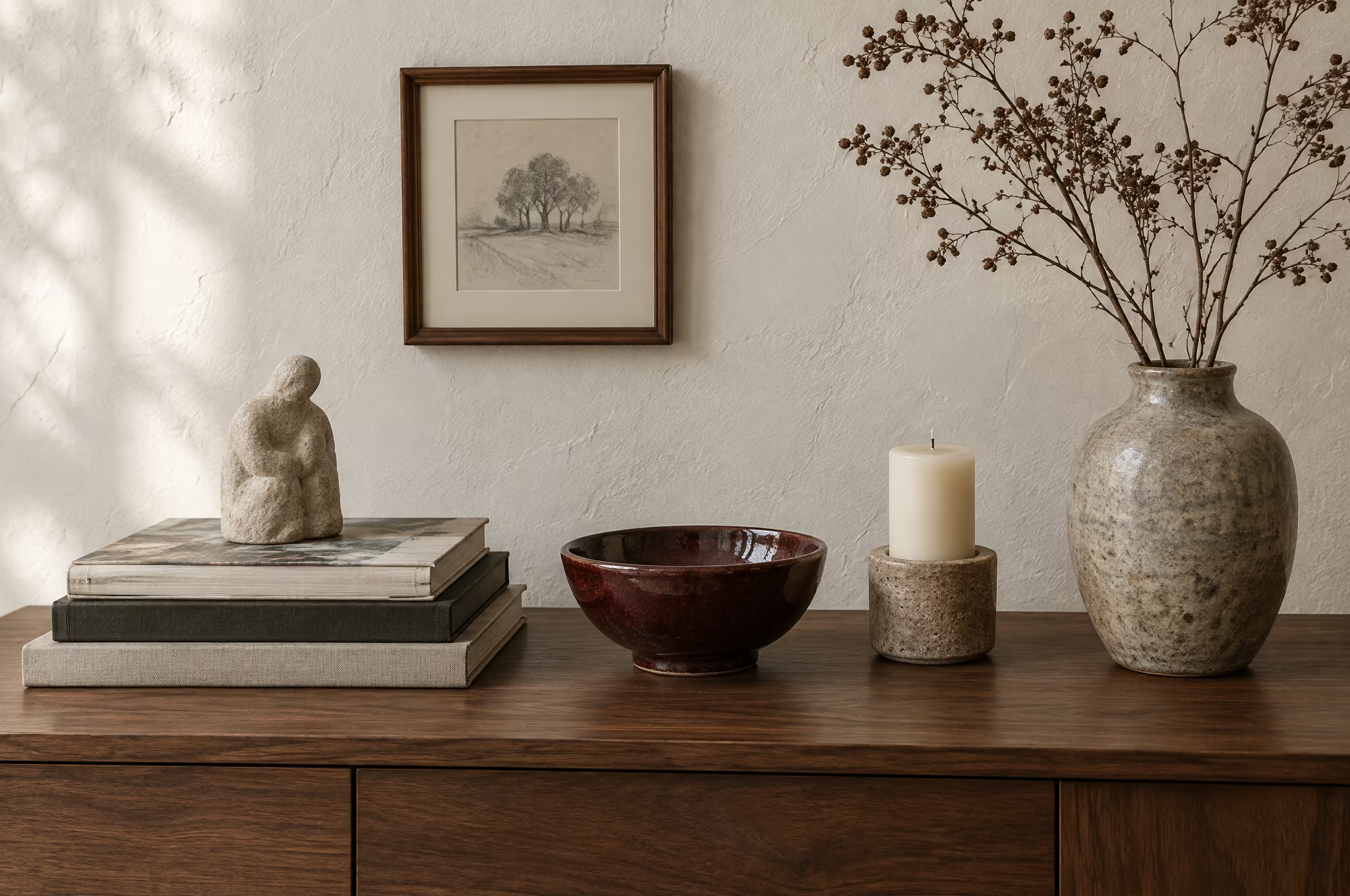
From Brand Mission
to Visual Language
Defining how Pastarello’s mission, positioning and creative lineage translate into a distinctive and credible visual identity.
This creative strategy establishes a clear framework for the brand’s visual direction, balancing editorial restraint with cultivated eclecticism to create a brand that feels personal, collected and assured.
Design Goals
What we aim to express through design
Calibre
Present the work at the level the studio already operates.
Right Clients
Speak to curious, engaged clients who value perspective.
Not Decorated
Eclectic references held together by editorial restraint.
Can Evolve
Recognisable without repeating, structured without restricting.
Design Strategy
The strategy outlines the key visual pillars of the brand. It defines the proposed aesthetic, colour approach, typography style and brand mood, ensuring all elements work together.
The identity will balance art, architecture and craft within a quiet editorial frame: generous space, strong composition and photography that feels like someone’s world rather than a room.
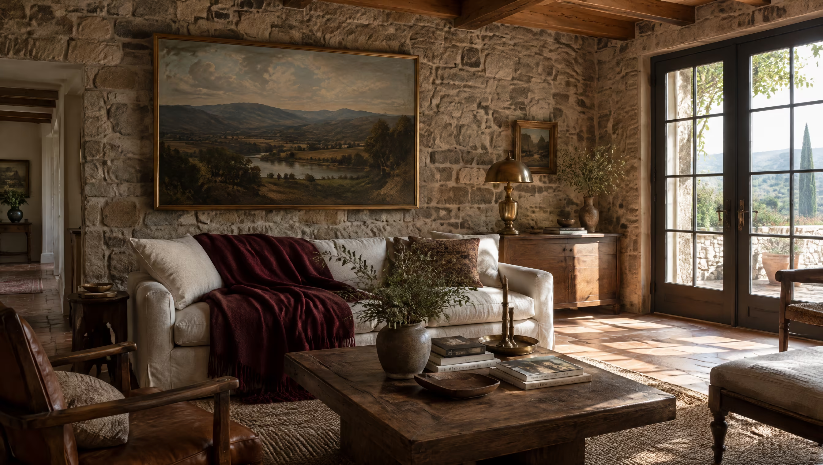
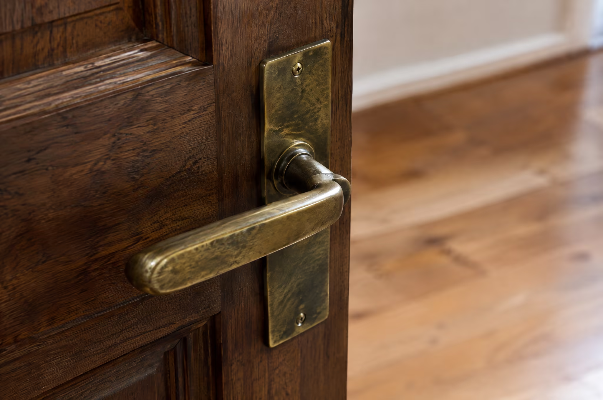
The palette will draw from oxblood and warm white, supported by the studio’s materials: burnished brass, polished nickel, walnut, oak and Calacatta marble. Never beige for its own sake.
Typography will be primarily serif, in the spirit of a refined Didone, paired with small archive-style labels that read like information from a design publication.
The mood will communicate a creative practice with a cultivated eye: curious, personal and confident, drawing the visitor in rather than trying to impress.
Mood &
Atmosphere
Logo
The move from Andrea Pastarello Design to Pastarello marks a shift from an individual practice to a founder-led creative studio. The identity should carry that ambition without losing warmth or intimacy.
For the wordmark, we envision a primarily typographic identity: an editorial serif with the character of a refined Didone, confident at large sizes and quiet in small ones.
For the brand mark, we envision a subtle, secondary symbol derived from the letter P. Recognisable and flexible, never an ornamental luxury monogram.
The studies shown explore typographic territories aligned with Pastarello’s ambition and positioning.
Visual Direction
03
Approach
From Strategy to Visual Language
The following directions represent distinct visual interpretations of Pastarello’s point of view and ambition.
Each approach explores a different expression of the identity, balancing editorial restraint, cultivated eclecticism and material warmth to define a visual language that feels personal, cultured and assured.
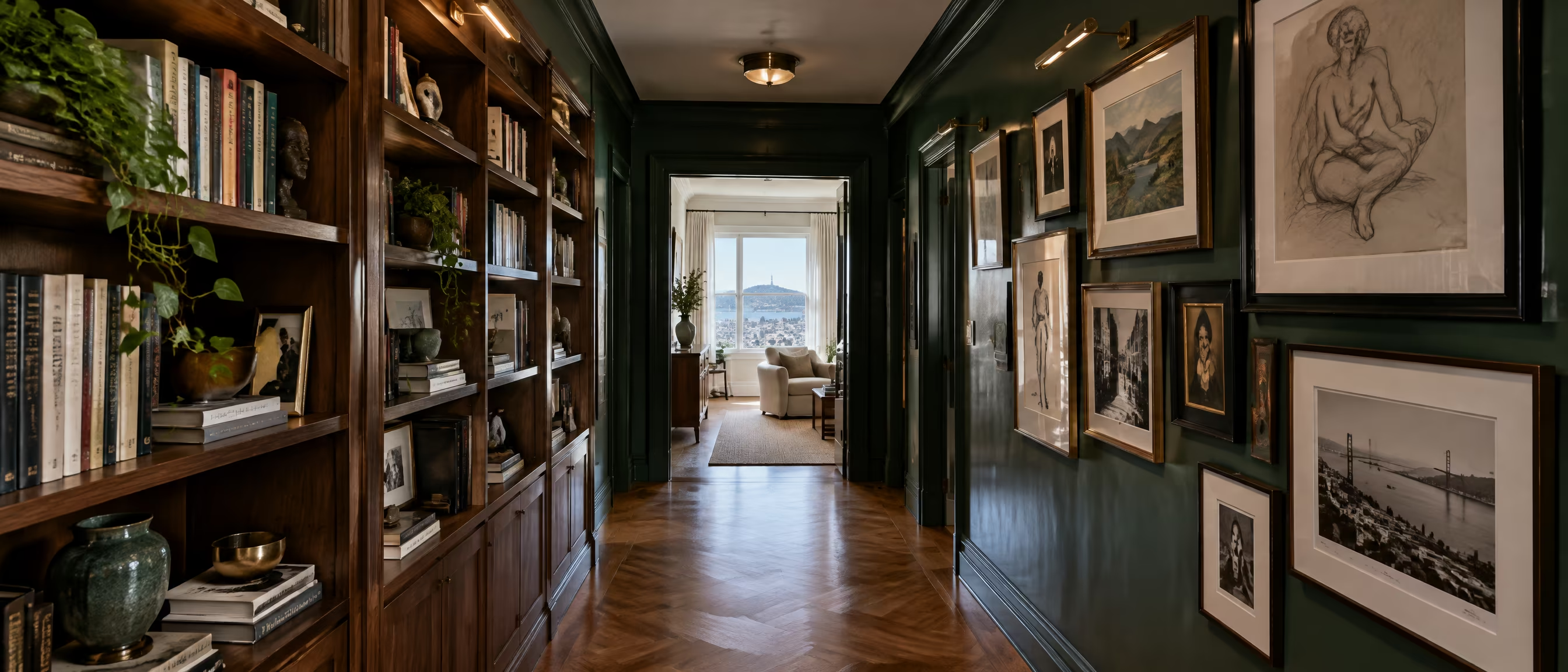
Visual Directions
Through analysis of the shared references and additional research, three core creative directions have been defined.
The following slides present each visual direction individually
Direction 01
Editorial Cultivated
A private studio archive, published.
Precise / Refined / Publication-like
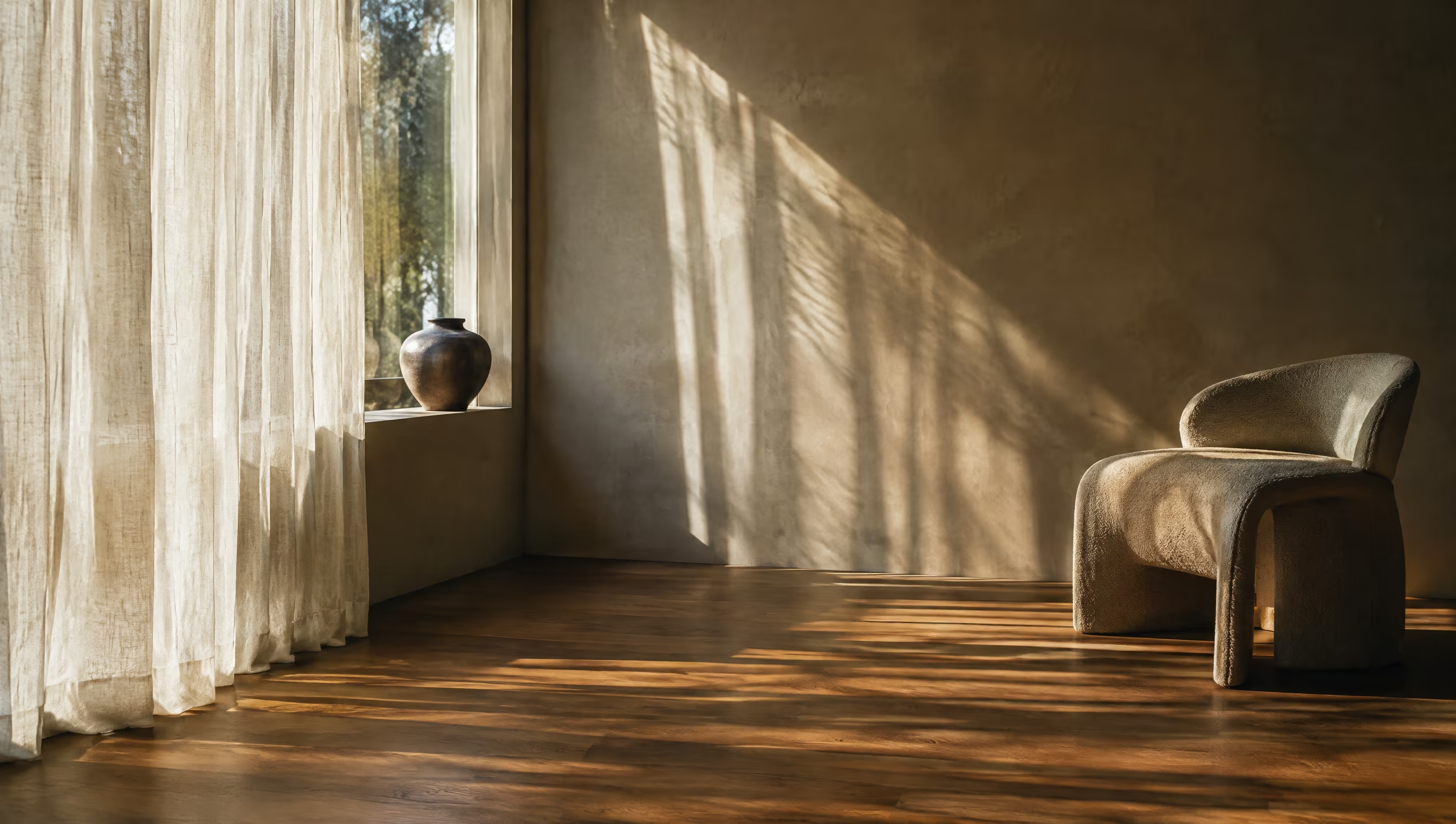
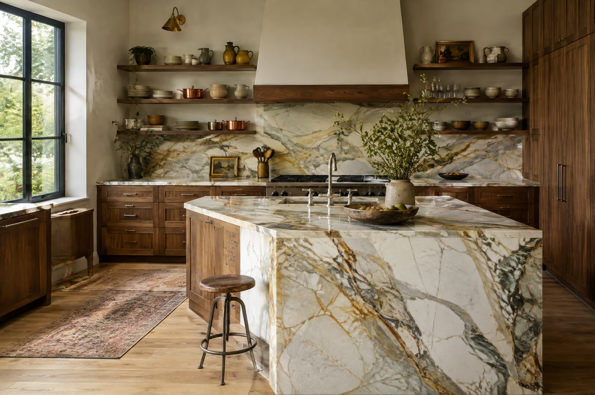
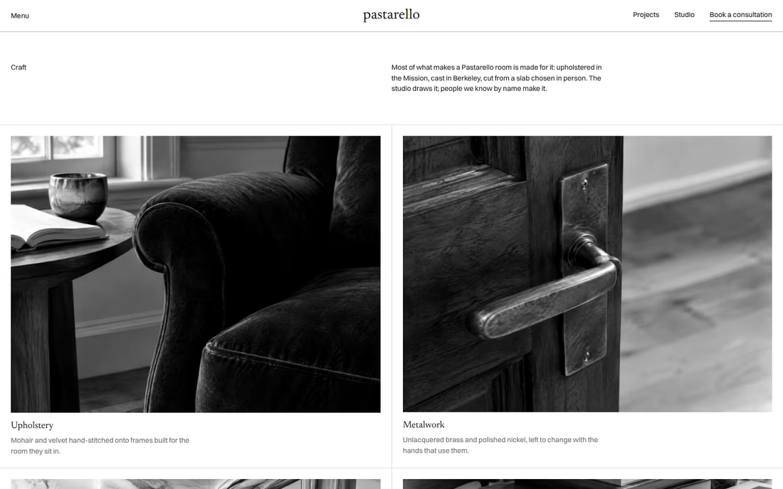
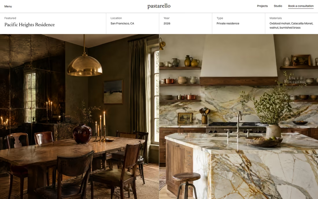
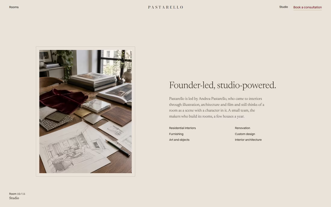
A sophisticated, publication-like direction that frames Pastarello’s work with the restraint of a contemporary design magazine. Warm white grounds, a refined serif, fine archive-style labels and generous space let photography lead, while oxblood appears as a quiet, recurring accent.
Visual Cues
Editorial photography, warm white and stone grounds, refined serif display, small archive labels, precise grids, oxblood used sparingly.
Similar Brands & Websites
- Joseph Dirand
- Studio Mellone
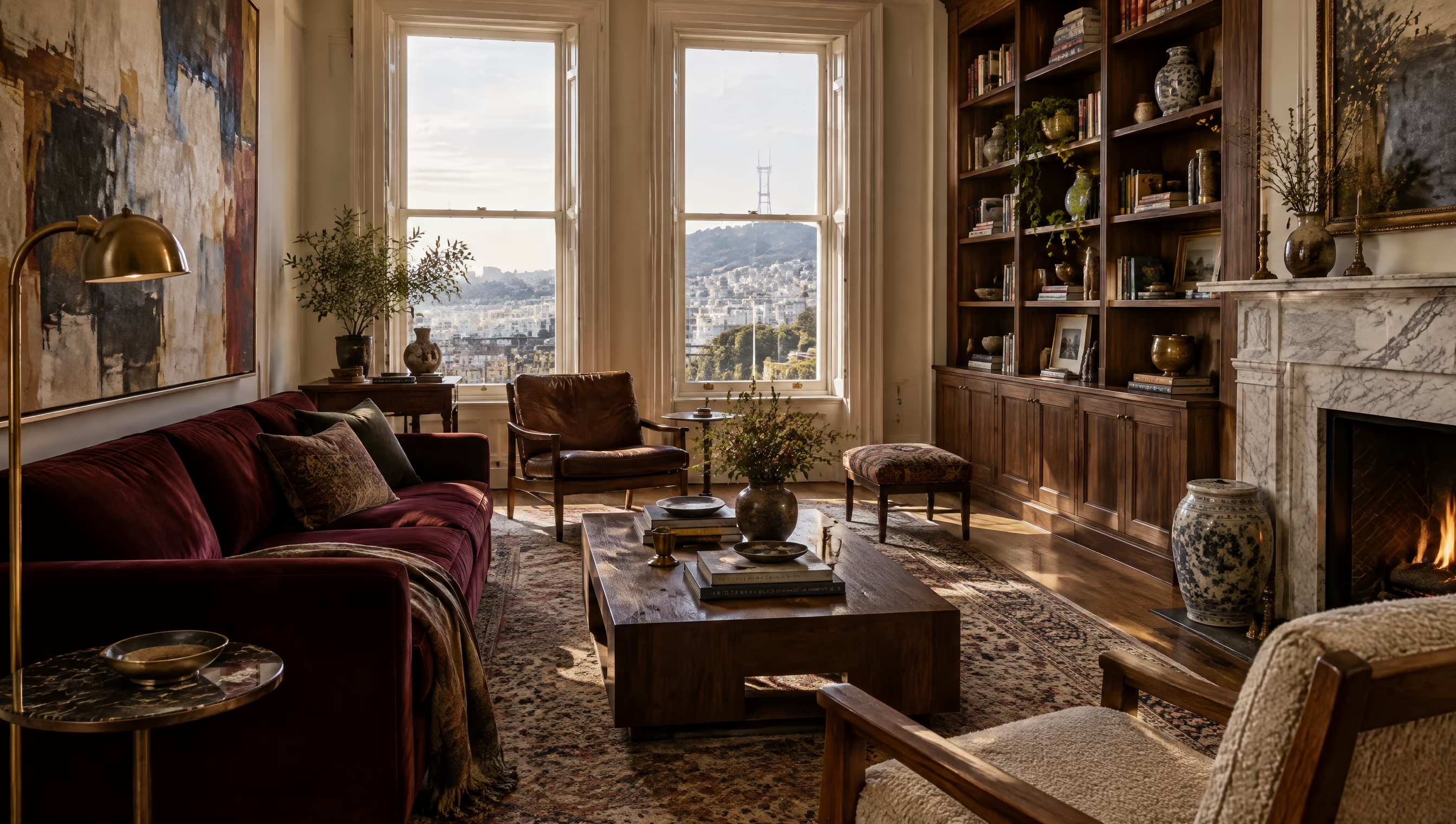
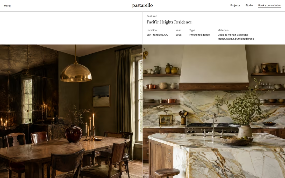
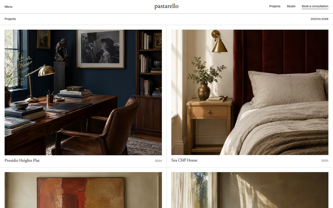
Direction 1
Composed interiors with natural light and room to breathe, presented like plates in a publication.
A cultured serif at display sizes, with small archive-style labels for information.
Clean grids, generous margins and a calm reading rhythm that lets the work lead.
Warm white, stone and ink, with oxblood as a quiet accent rather than a statement.
Direction 02
Oxblood & White
A signature colour, used with intent.
Graphic / Distinctive / High contrast
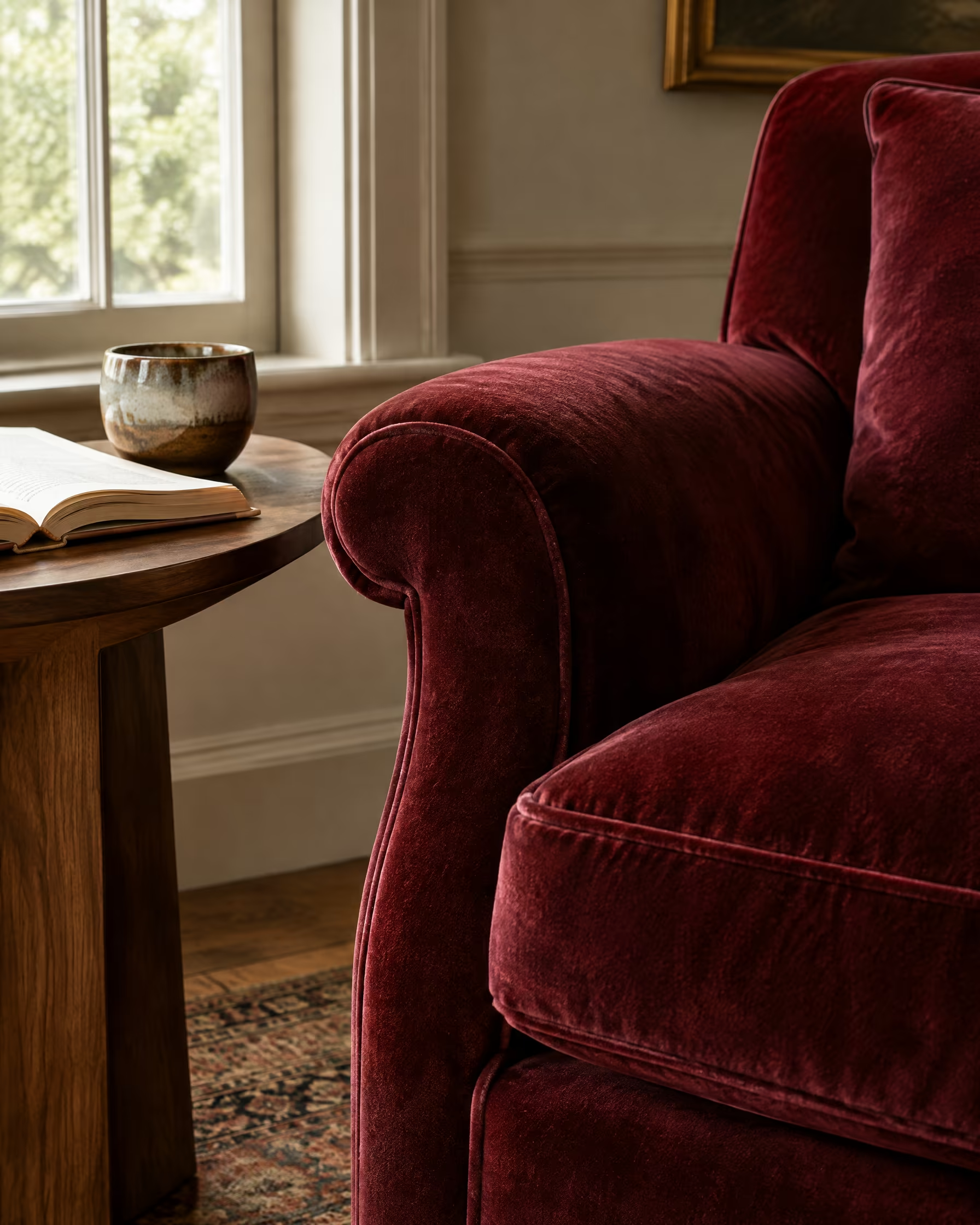
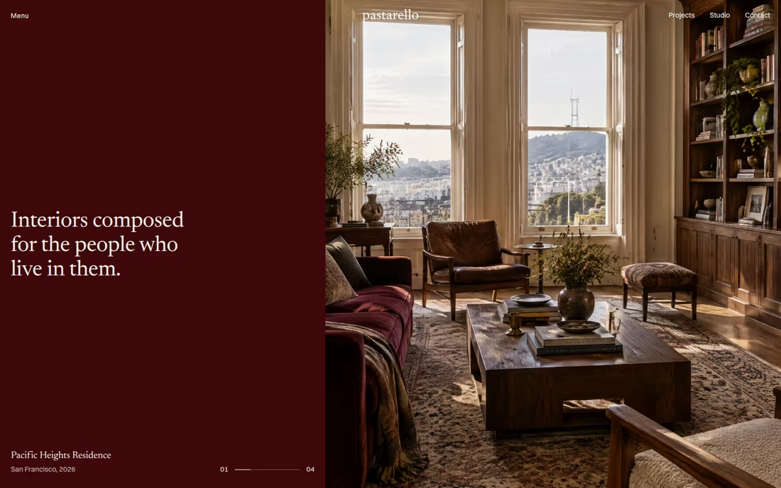
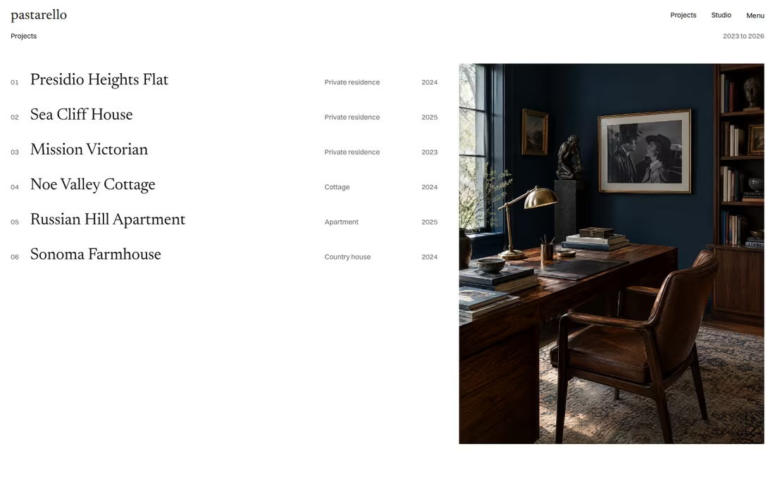
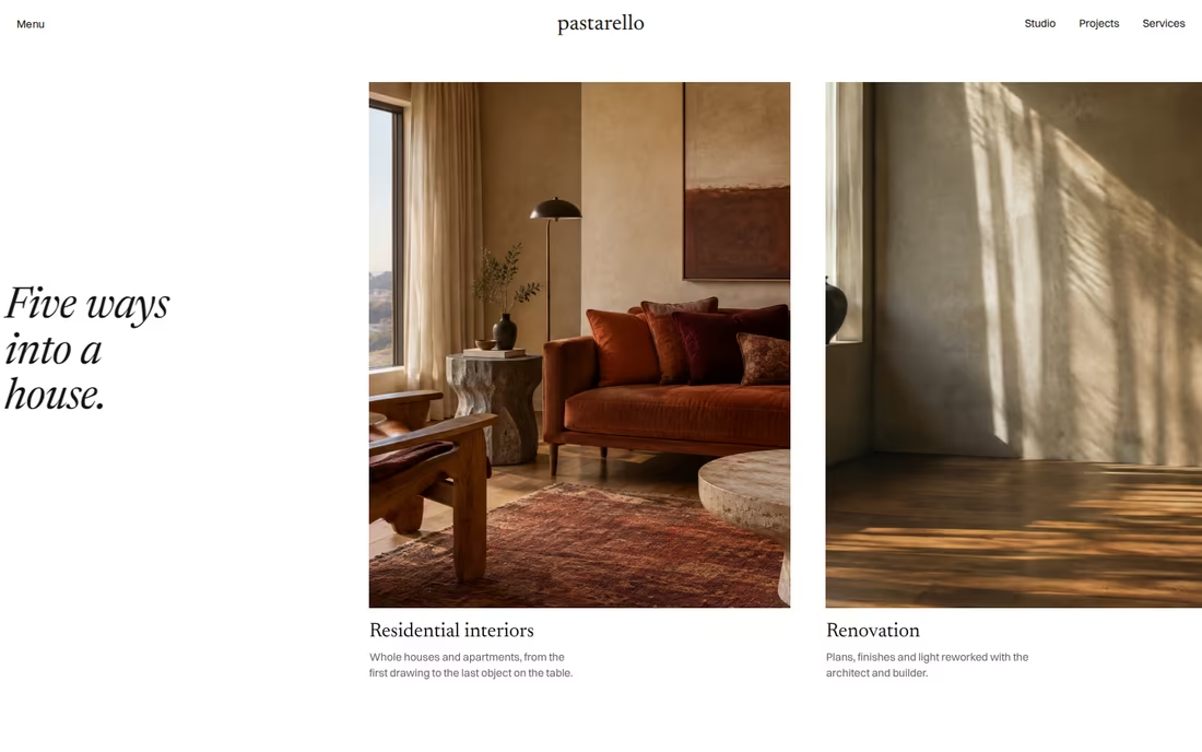
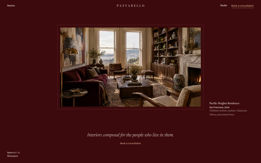
Built around the client’s strongest colour direction: oxblood and white. Oxblood becomes a signature rather than an accent, appearing as full fields, architectural framing and selected typography, while large photography sits in generous white space. The result is graphic, confident and unmistakably Pastarello.
Visual Cues
Deep oxblood fields, strong white grounds, black typography, bold editorial serif, large photography, graphic contrast, occasional natural material tones.
Similar Brands & Websites
- Konekt
- Loewe
- Jacquemus
Direction 2
Oxblood used as a surface: menus, bands and framing that make the brand recognisable at a glance.
A high-contrast serif with presence, set against white for graphic clarity.
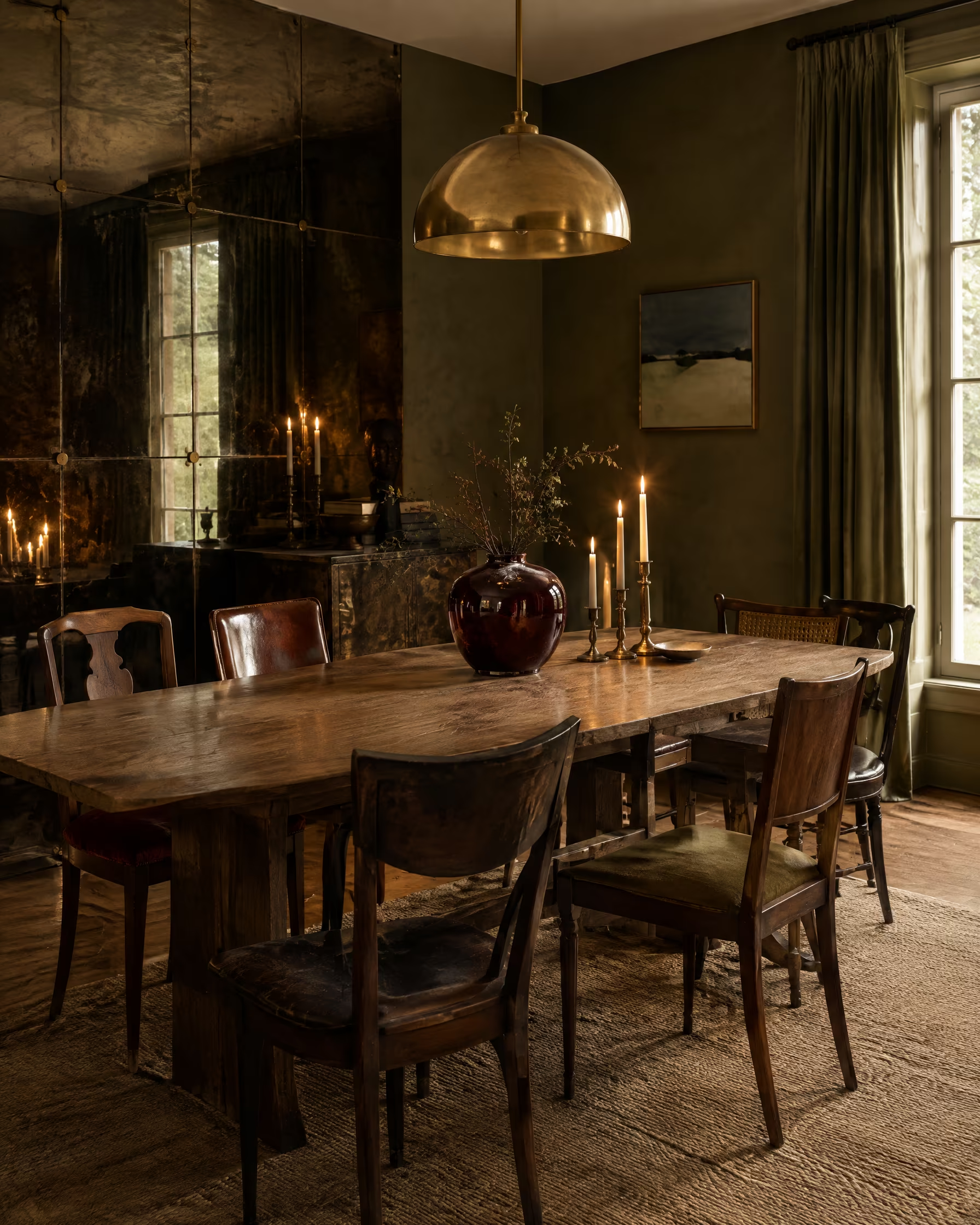
Velvet, brass and walnut introduced through photography, never as decoration.
Images given space and structure so the work reads as confidently as the colour.
Direction 03
Art, Film & Space
Interiors as a sequence of film stills.
Cinematic / Atmospheric / Narrative
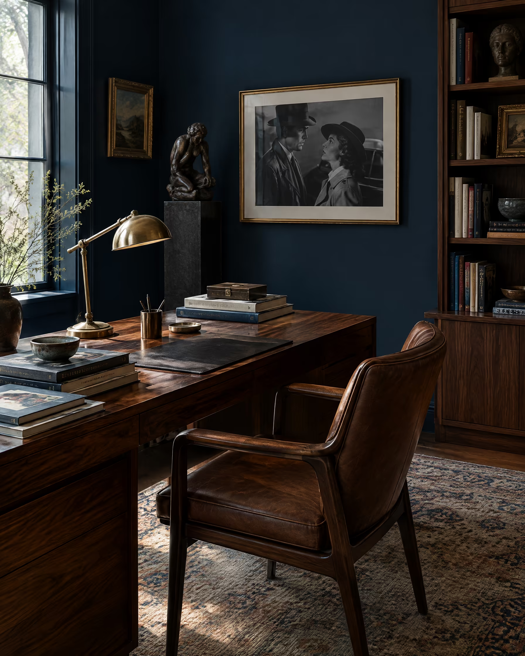
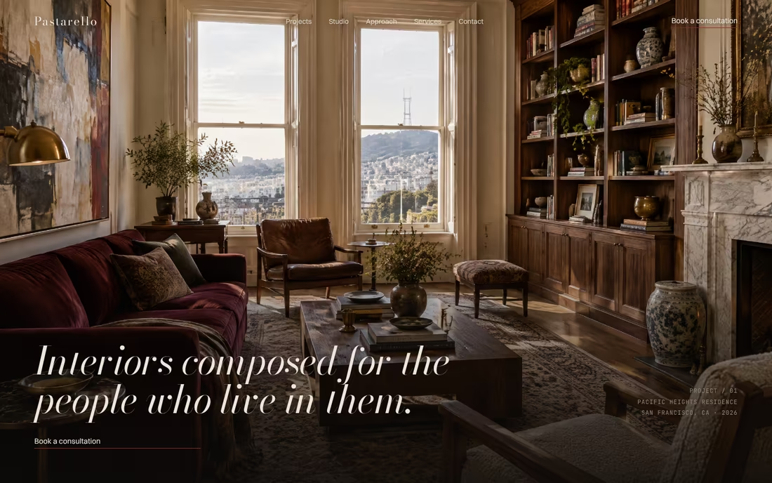
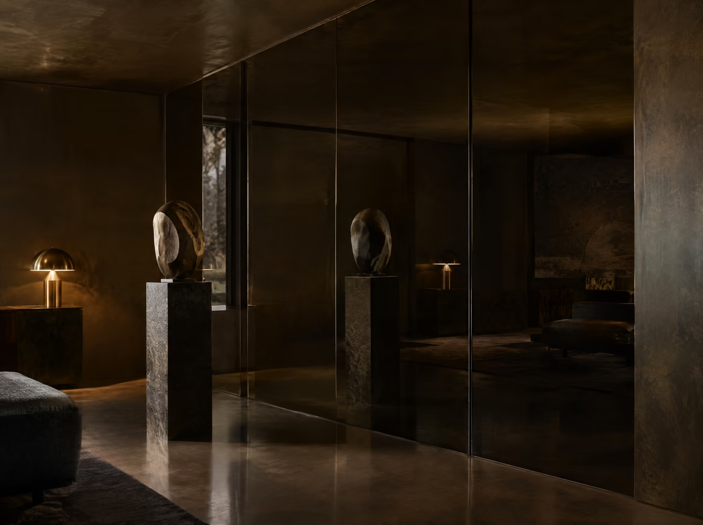
Translating Pastarello’s background in fine art, film and world-building into the brand. Cinematic crops, strong light and shadow, dark grounds with ivory type and slow editorial pacing make the experience feel like a sequence of film stills, where environment and character are inseparable.
Visual Cues
Cinematic photography, dramatic crops, black and ivory, oxblood accents, large italic serif, slow pacing, light and shadow, full-screen imagery.
Similar Brands & Websites
- Dimore Studio
- Acne Studios
Direction 3
Low light, deep shadow and wide crops that turn rooms into scenes with a character in them.
Black and ivory with oxblood accents, giving the work depth and atmosphere.
Expressive display type used sparingly, like titles in a film.
One image at a time, full screen, so the story unfolds rather than being listed.
Next Steps
04
Selecting
Moodboard
We’ve developed three distinct visual directions for Pastarello, each rooted in the brand strategy while exploring different ways the studio can express its point of view, from editorial restraint to a signature colour and a cinematic, narrative world.
How to select
At this stage, the objective is to identify which direction feels most aligned with Pastarello’s vision, positioning and long-term ambition. In particular:
- Which direction feels most like Pastarello’s future
- Whether the tone should lean more editorial, graphic or cinematic
- How the typography, colour, imagery and overall visual language resonate
- Any elements you’d like us to develop further, refine or combine
To align on the preferred direction and next steps, we will arrange a call to review feedback in detail.
Following review and discussion of the creative directions, the next stage will focus on refining the selected pathway.
This will include:
- Defining the logo
- Defining typography system
- Finalizing color palette
- Developing the brand visual system
We look forward to speaking soon and refining the direction together.